Crafting the perfect resume is much like preparing for a battle: you arm yourself with a lethal combination of skills, experience, and achievements, ready to catch the recruiter's eye. But wait - have you thought about the font you're using?
Fonts are the unsung hero, the silent warrior in the field of job hunting. It isn’t about frivolous aesthetics or flashy designs - it's about ensuring readability, conveying professionalism, and yes, making a statement about who you are. This guide shines a light on the best fonts for your resume and why your choice matters more than you might think.
How to choose the right resume font: Key principles
Prioritize readability and consistency
For those currently frozen with indecision over the right font to use on your resume, just remember this - any font is appropriate, so long as it is:
- Easily readable by human eyes
- Easily readable by ATS eyes
- Used consistently
- Professional
Stick to the basics
While it may be tempting to get creative and experiment with different styles, colors, and extravagant font choices, it's important to remember that simplicity and clarity are key.
Using standard fonts that are widely recognized and readable ensures that your resume is easily accessible and understandable by hiring managers and recruiters. Opt for commonly used fonts like Arial, Times New Roman, or Calibri, as they are widely supported across different platforms and devices.
Opt for sans-serif fonts
What are sans-serif fonts? They’re the ones featuring simple, straight lines without decorative embellishments (like the little ‘feet’ at the bottom of letters). Most default fonts, like Arial and Calibri, are sans serif. If you strongly prefer a serif font, choose something simple and classic like Georgia or Times New Roman.
In the past, serif fonts were suggested to give your resume a traditional, professional feel. But these days, most recruiters are reading your resume on a computer screen, so sans-serif fonts are the most readable and preferred.
Avoid special character fonts
The worst fonts to use are ones that convert letters into special characters. Look at the following example:
The text on the left is perfectly legible, with a space between the letters. The text on the right has combined the two letters into a single special character with no space in between, which is not only harder to read, it also can’t be scanned properly by Applicant Tracking Systems (ATS).
Most employers nowadays use ATS, which are programmed to scan your resume for specific keywords and filter out those without relevant experience. If, for example, you’re applying for a Financial Analyst position, ATS may be programmed to search for the keyword ‘financial reporting.’ If you’ve used a font that combines ‘fi’ and ‘ti’ into special characters, the ATS will read this as ‘#nancial repor#ng’ and assume you don’t have what it’s looking for.
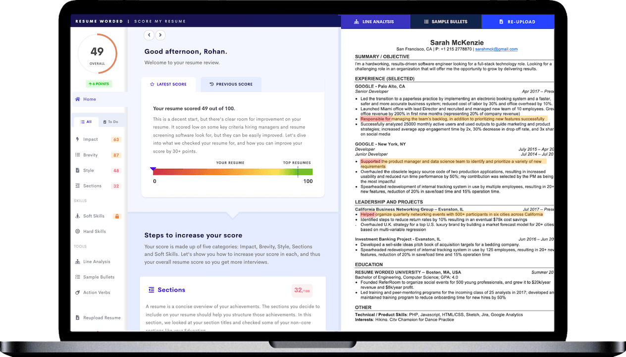
To avoid this, use a standard font on your resume and double-check to make sure that your letters haven’t been converted into special characters, or use the tool below to confirm that your resume is easily read by ATS. The tool also evaluates your resume on key criteria such as resume length, font size, spacing and margins.
The 10 best resume fonts
If you’re still not sure which font to use on your resume, any of these are good choices:
- Arial: This sans-serif font is universally recognized and displays well across various platforms, making it a safe, professional choice for resumes.
- Calibri: Calibri is the default font for Microsoft Word and is well-suited for resumes due to its soft, rounded yet modern appeal that enhances readability.
- Helvetica: A popular choice in the corporate world, Helvetica is clean, modern, and shows up well both in print and on screen, thus elevating the overall professional look of your resume.
- Trebuchet: Trebuchet offers a more casual yet still professional aesthetic, ideal for those seeking a slightly unique yet still easily readable font for their resume.
- Avenir: This is a sleek, modern font that combines professionalism with a touch of character, making your resume stand out without sacrificing readability.
- Verdana: Verdana was specifically designed for screen readability, making it a strong choice for digital resumes that need to maintain clarity at various screen sizes.
- Montserrat: Montserrat is a modern, geometric sans-serif font that gives your resume a clean, contemporary feel while still being easy on the eyes.
- Garamond: If you're aiming for a more traditional look, Garamond's timeless elegance can give your resume a sense of sophistication while remaining highly readable.
- Georgia: This serif font is specifically designed for screen readability, allowing it to maintain legibility and professionalism even when viewed at smaller sizes.
- Times New Roman: A classic choice, Times New Roman is a universally safe choice that conveys reliability and conventionality, though it may come off as unoriginal or unimaginative to some hiring managers.
The best fonts for your industry
Regardless of the industry, legibility and professionalism should be prioritized over unique or eccentric font choices. But, if you’re hoping to illustrate your fit in the culture of a company, here are some best fonts for tech resumes, executive resumes, engineering resumes, and more.
- Tech Industry: Opt for modern, clean lines that convey innovation. Fonts like Roboto, Avenir, or Verdana project a sleek and modern image that resonates well within this industry.
- Finance & Consulting: Traditional and highly professional industries like finance and consulting prefer classic fonts. Times New Roman, Arial, or Garamond are solid choices.
- Creative Industries: Artistic fields such as graphic design or advertising could allow for more creative fonts, as long as they remain professional and legible. Try Lato, Open Sans, or Montserrat.
- Healthcare: A mix of traditional and contemporary may be best here. Consider fonts like Calibri or Helvetica that balance modernity with professionalism.
- Education & Academia: Opt for readability and authority with fonts like Palatino or Book Antiqua.
Top tips to enhance readability and visual appeal
Font size
If you’ve ever thought about reducing your font size or margins to fit more information on a standard one-page resume: Please don’t do this! Smaller fonts and less white space mean hiring managers will find it harder to skim your resume. (Plus, it’ll be totally obvious what you’re doing — by now, recruiters have seen every trick in the book.)
Never do anything that makes your resume less readable, even if that means you have to trim a couple of achievements or omit an older position altogether.
In most fonts, an 11 or 12 point size is standard (excluding your headings). The exact size you should choose depends on the specific font, but in general, you should never go below 10 points, and more than 12 for standard text isn’t necessary.
At a glance, a PDF of your resume should be easily skimmable, which includes using standard headings and plenty of white space.
Font styling
Using basic styling to make things stand out on your resume is fine. You can format your resume title, section headings, job titles, and company names in bold to make them more easily readable, with subheadings in italics. Generally, avoid underlines, which make your resume — you guessed it — harder to read.
As for bolding random words and phrases, just don’t. It can be tempting to want certain skills or accomplishments to stand out, but the best way to do this is by using appropriate headings, accomplishment-led bullet points, and a resume summary or short blurb to highlight anything particularly noteworthy.
Font color
When it comes to using colors, images, or other design elements on your resume, less is more. Which is to say, the perfect amount is zero. A purely black-and-white resume is the easiest to read (because it affords the most contrast) and to print out, in case the hiring manager chooses to do so.
If you absolutely must use colors on your resume, choose a single color and use it sparingly — but really, first consider whether it’s absolutely necessary, as even a lot of creative or design roles don’t require that creativity to be reflected in your resume design.
Font consistency
Whichever font you choose, be consistent! Switching between fonts makes it harder to read, looks unprofessional, and will distract a recruiter’s attention from the actual content of your resume. The same rule applies to your resume formatting in general — if you’ve used bold, italics, or capital letters for one section or subheading, use that same style consistently for each entry.
Line and letter spacing
Don't overlook the impact of spacing on the overall readability of your resume. It's not just about choosing the right font size or style, but also about ensuring there's ample room for your text to breathe.
Squeezing in more text by reducing line or letter spacing might seem like a smart move to fit everything you want to say, but resist this temptation. Just like with tiny font sizes, recruiters will notice — and it won't win you any points. A cramped resume is harder to read, and if your resume is tiring on the eyes, it's less likely to be read in depth.
A good rule of thumb is to aim for 120–145% line spacing. So, if your text size is 12 points, your line spacing should be between 14 and 17 points. For letter spacing, the default setting in most word processors should be fine, but make sure it doesn't look too squashed or too stretched out.
File type: PDF
Where possible, you should always format your resume as a PDF. Why? It’s the only way to guarantee that your resume will look the same to a recruiter as it does to you, irrespective of the software they use or whether it’s being viewed on paper or a screen. Different versions of Word can change your layout and formatting, but a PDF will always look the same, no matter what program is used to open it.
In the rare case that a company specifically asks for your resume in Word format, make sure you’ve used a standard font, as downloadable fonts won’t appear correctly and may make your resume unreadable.
Related: What to Name Your Cover Letter and Resume Files
General do’s and don’ts for resume fonts
Do use a basic font that’s easy to read. The default font on your word processor of choice is almost always fine.
Don’t use fonts that are particularly thin, light, bold, or flowery. Your primary focus should be on readability, not design.
Don’t use ‘creative’ fonts like Comic Sans or Papyrus. Most people don’t care about fonts, with the exception of a few very divisive choices. Avoid these at all costs.
Don’t use a lot of custom downloadable fonts or templates. Keep it simple — you want a hiring manager to be thinking about the content on your resume, not how fancy it looks.
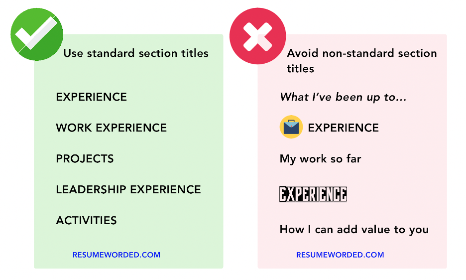
Do use standard fonts and section titles and avoid special characters and images, like this:
Do make sure your resume can be read by ATS and check for other potential issues by using Score My Resume.
Don’t overthink it. As long as your resume uses a standard font, size, and layout, it’ll be perfectly readable — which is the only thing that really matters.


