In an increasingly competitive job market, you want your resume to stand out in a good way. You’ve thought about using color for visual appeal. But should color be used on a resume?
Generally, color should be avoided, especially for more formal job applications. In this article, we will explore the pros and cons of using color on a resume, and the best ways to use color strategically (and sparingly).
Pros and cons of using color on a resume
Making the best first impression is what each of us wants when sending out our resume, right? Recruiters receive hundreds of resumes on their desks. So how are you going to grab a potential employer’s attention over the rest? If you’re considering using color, also consider the following:
Benefits of using color in a resume
Making an impression
Using color could help your resume stand out and make a positive impression, particularly when applying for a creative role. The general advice is to avoid light colors for legibility – and keep the layout clean and within a traditional format.
Highlighting key information
Color on a resume can focus attention on important details. Try using color to highlight, but stick to those that are appropriate for the industry and avoid using bright or clashing colors.
Indicating personality and creativity
Your resume is an extension of your personal brand, so color could help elevate and convey a creative approach to life, a crucial skill in some industries, while also providing a useful tool for structure.
Risks of using color in a resume
Distraction
Use of color may distract from content; it’s best to keep the layout clean and easy to read. Your application will be taken more seriously if it’s your relevant skills and experience that stand out, not your font color.
Unprofessional
Color on your resume could appear unprofessional in more “serious” industries, such as finance or law. Strike a balance between creativity and professionalism.
Accessibility issues
Color on your resume may decrease legibility. It all comes down to contrast and that’s usually found in black and white. For color blind readers, what you’ve highlighted in color might go unnoticed. If using, choose colors that are accessible to all readers and with strong contrast levels.
Applicant Tracking Systems (ATS) readability
The priority is to get your resume through Applicant Tracking Software and on to an actual person’s desk. There are ways of adding color that don't affect ATS but go carefully. While online checkers can give you an idea about readability, it’s best to keep to a standard layout. There are some great templates out there which make the process less torturous!
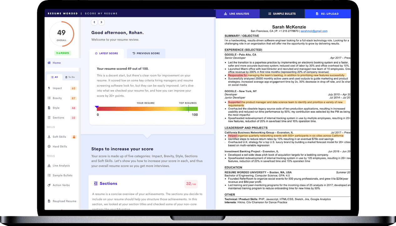
If you choose to add color to your resume, I’d recommend uploading it to the tool below to check if it is readable by ATS.
How to use color effectively
Colors on a resume can provide the right effect if used strategically. You can use color to highlight key sections, like your headers, job titles, and achievements.
But keep in mind that it’s generally recommended to stick to one or two colors to avoid visual clutter. If you’re going to include colors in your resume, use colors that complement each other and use them consistently.
Also, try to avoid using color in the main body text, which should remain black against white to ensure readability. And always be sure to check how your resume reads when printed in black and white.
What are the best colors to use on a resume?
The best resume colors depend on the profession you’re interested in and the impression you want to convey. Different colors can communicate different moods and meanings. Using them strategically in your resume can help you make the right impression. Here are the best colors to use on your resume:
- Black: Formal and traditional, should be used for text to ensure high readability.
- Gray: An excellent neutral color, suggests sophistication and provides a modern, sleek look.
- Navy Blue: Conveys trust, confidence, and stability, making it a safe choice for any industry.
- Dark Green: Symbolizes nature, growth, and calm, ideal for healthcare or environmental sectors.
- Burgundy/Deep Red: Can signal power and passion but use sparingly – can overwhelm if used excessively.
When and when not to use color on your resume
Color on a resume was once considered unacceptable. But the perspective of employers is changing. So, how do you know if color on a resume is the right choice for you? It all depends on the industry, the company culture, and the role.
Industry
In creative industries, like graphic design and marketing, a well-designed resume with color might be seen as an extension of your creativity.But for more formal industries, like finance or law, it's generally best to stick with a black and white resume. Organizations in these industries value formality and straightforwardness over creativity.
Company culture
Informal, modern companies, like start-ups, design firms, or tech companies might appreciate strategic use of color on your resume, as these organizations value individuality.
But for more formal/conservative companies, a more conservative, black and white resume is better. These organizations often have a conventional culture and may see the use of color as too casual.
Role
If the role involves design, color can signal that you have an eye for visual presentation. But if you're applying for a role where the focus is on analytical skills and decision-making, opt for a more conservative, color-free resume.
How to add visual interest without color
If your resume isn’t designed to be clear, professional, and easy to scan without color, you’ll find that adding color won’t make it any more reader friendly. Here are some key resume design principles:
Optimize layout and structure
Create a sense of structure based on columns or an invisible grid. Use bullets, section breaks, and headers to organize information, and draw attention to key points.
Use different font sizes and styles
Using different font sizes and styles can create a visually appealing document without relying on color. But never prioritize visual appeal over readability! You can use larger font sizes for section headers, bold for job titles or companies, and italics for necessary information like dates. For more, see our article on the Best Fonts for Resumes.
Incorporate white space
A balanced use of white space can make a resume look clean and organized. Adequate margins and space between sections will provide visual breaks. Too little white space or margins will make your resume feel cluttered.


