Whether you’re creating your first ever resume or updating it for the fiftieth time, it’s important to get the basics right. Things like font choice, margin size, and line spacing might not seem like make-or-break resume elements, but presentation and readability are, which means these small things can actually make a big difference.
Luckily, the standard practices for most of these are to stick to the default settings — which, in the case of line spacing, means that 1.0 line spacing is usually the best option. To learn more about why — and when it’s okay to deviate — keep reading.
Why line spacing matters
Line spacing on its own doesn’t matter — which is to say, nobody’s going to reject you solely because you used 1.15 line spacing instead of 1.0.
What matters is the overall appearance of your resume. Choosing the right line spacing makes your resume look attractive, organized, and easy to skim. Most importantly, it avoids calling attention to itself, which is why sticking to standard conventions for resume presentation is usually the right call.
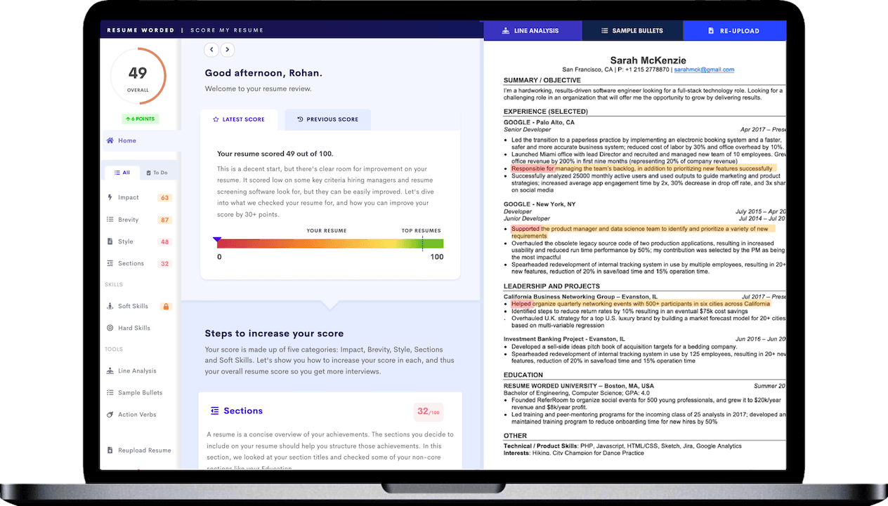
If you’re not sure if you’ve chosen the right line spacing for your resume, upload it to the tool below — it’ll let you know if your resume is formatted correctly.
How your font influences line spacing
Line spacing doesn’t exist in a vacuum. Your font choice and size also matter — different font choices will impact the way your line spacing appears. Here’s how to navigate this for different kinds of fonts.
Modern fonts
Clean, modern fonts like Arial or Calibri are usually designed with both paper and computer screens in mind, which means they tend to be well-spaced and easier to read. Stick to the standard 1.0 line spacing to maintain their sleek, professional look.
Dense fonts
More old-fashioned fonts like Garamond or Times New Roman are still classic choices for resumes, but they also tend to be denser and more compact. This means they can be a little harder to read, which makes 1.15 line spacing a better option.
Larger font sizes
If you’re using a larger font size for better readability (above 12 point), stick to 1.0 line spacing. Larger fonts naturally create more white space, which means you don’t need to add extra line spacing.
Creative fonts
If you’ve opted for a more unique font, it’s important to make sure your line spacing complements your font choice. This means you may need to play around with different line spacing to find the best look — the goal is to balance high readability with aesthetic appeal.
Should a resume be double spaced?
Double spacing isn’t recommended for resumes. In general, anything over 1.15 spacing only wastes valuable resume space. It also tends to look like you’re trying to hide a lack of content, which is an instant red flag. Instead of increasing your line spacing or resume margins, follow our tips on how to write a resume with limited work experience, like adding relevant certifications, projects, or volunteer activities.
How line spacing interacts with ATS
It isn’t just recruiters or hiring managers who will see your resume — before that, there’s a decent chance it will have to go through an Applicant Tracking System (ATS). ATS are used by most companies to help streamline the hiring process, which makes it crucial to understand a little about how they work. Here’s what you need to know:
- Standard line spacing (1.0 to 1.15) is generally ATS-friendly. These systems are designed to parse most types of standard formatting, which is another reason to stick to the default options for line spacing, font choice, and margin size.
- Overly small (below 1.0) or large (above 1.15) line spacing may confuse ATS and lead to parsing errors. Stick to the standard range for best results.
- Using consistent line spacing throughout your resume helps ATS distinguish between different resume sections. Try not to change it too much, since there’s no guarantee it will look the same in every software program.
- It’s okay to change your line spacing for important elements, like section headings. Using slightly larger line spacing or a blank line before different resume sections can help define the beginning and end of sections for ATS.
- If you want other important information (like your contact information or job title) to stand out, opt for bold, italics, or capital letters instead of increasing your line spacing.
- To ensure your resume is ATS-compatible, try running it through a free resume checker first. These use ATS software to scan your resume and provide feedback, so if they can read it okay, it’s probably good to go.


